Butler - Finest Hospitality

Branding The Next Big Startup

Butler is created with a single mission to help free up time for people who need them most. They take care of the clutters in life, so their customers have time for what really matters.

Butler’s logo-mark is a representation of who they are as a company – the external perimeter is designed to be rounded to represent their outward attitude ― human-centric, focused on customer service and are always caring towards both customers and employees. Conversely, the sharper edges of the internal perimeter symbolize their precision, professionalism and meticulousness.

Project Type

Logo Design, Branding, App UX/UI, Brand Guide Design, Print Design, Illustration

Butler’s logo-mark is a representation of who they are as a company – the external perimeter is designed to be rounded to represent their outward attitude ― human-centric, focused on customer service and are always caring towards both customers and employees. Conversely, the sharper edges of the internal perimeter symbolize their precision, professionalism and meticulousness.

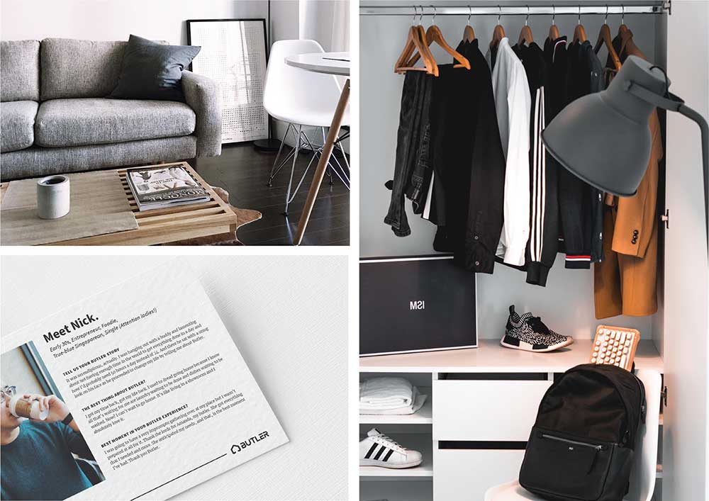
Working directly with Butler Founder & CEO, Poon DQ, I’ve gained valuable insights into their company culture and operations and translated it visually into an encompassing set of brand guidelines.

Here are some selected pages from the Butler Brand Book.